Building the Foundation of PiUI - Logo, Alerts, and the First Master Components
#piuiPublished: 17 Sep, 2025

PiUI Takes Its First Real Shape 🎨
We’ve officially started working on PiUI as a dedicated design system. This milestone is not about the number of components shipped, but about defining the foundations that everything else will build upon.
At this stage, PiUI is focused on clarity, consistency, and discipline. With the logo finalized and the first Alert component designed for both light and dark modes, we are intentionally setting the tone for how the system will evolve ⚙️.
“A design system doesn’t scale products by itself. It scales decisions.”
As products grow, inconsistencies rarely appear all at once. They creep in quietly—slightly different paddings, inconsistent colors, mismatched interaction patterns. Over time, this slows teams down. PiUI is being built to prevent that early. This update outlines what we’ve built so far and, more importantly, why we started here.
What PiUI Stands For 🧭
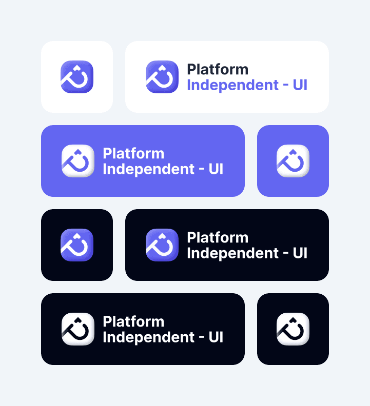
PiUI stands for Platform-Independent UI.
That name is intentional. PiUI is not tied to a single framework, device, or rendering layer. It is designed to express interface decisions in a way that can travel—across platforms, products, and teams—without losing meaning. At its core, PiUI represents a commitment to:
- Platform independence — concepts that work on web, mobile, and beyond
- Consistency over cleverness — predictable behavior beats novelty
- Separation of intent and implementation — design decisions outlive frameworks
- Longevity — systems that evolve without constant rewrites
This philosophy influences every decision in the system, from how components are named to how states and variants are defined.
PiUI is about what an interface should communicate, not where it is rendered.
Platform Independence in Practice
| Design Concern | PiUI Approach |
|---|---|
| Visual tokens | Abstracted, not hard-coded |
| Components | Behavior-first, not framework-first |
| Themes | Semantic, not color-based |
| Layout rules | System-driven, not screen-specific |
| Documentation | Explains why, not just how |
By staying platform-agnostic at the design level, PiUI makes it easier for teams to implement the same UI language across different stacks—whether that’s web, native mobile, or future platforms.
Why This Matters Long-Term 🤔
Frameworks change. Products evolve. Teams grow. Design intent should not be rewritten every time technology shifts. PiUI exists to preserve that intent and make it portable. This is what allows PiUI to scale—not by locking teams into a toolchain, but by giving them a shared language that survives change.
What PiUI Is Solving
| Problem | How PiUI Helps |
|---|---|
| Repeated design decisions | Shared tokens, components, and rules |
| Inconsistent UI behavior | Standardized interaction patterns |
| Designer–developer mismatch | Single source of truth |
| Scaling across products | Modular, reusable foundations |
This is not about visual uniformity alone. It’s about predictability and trust across interfaces.
Establishing Identity: The PiUI Logo ✨
Before any components, PiUI needed a clear identity. The logo is intentionally simple and neutral—designed to sit comfortably across different products, platforms, and contexts. The logo reflects three core ideas:
- Stability – the system should feel dependable
- Modularity – components that fit together naturally
- Platform independence – usable across products and teams
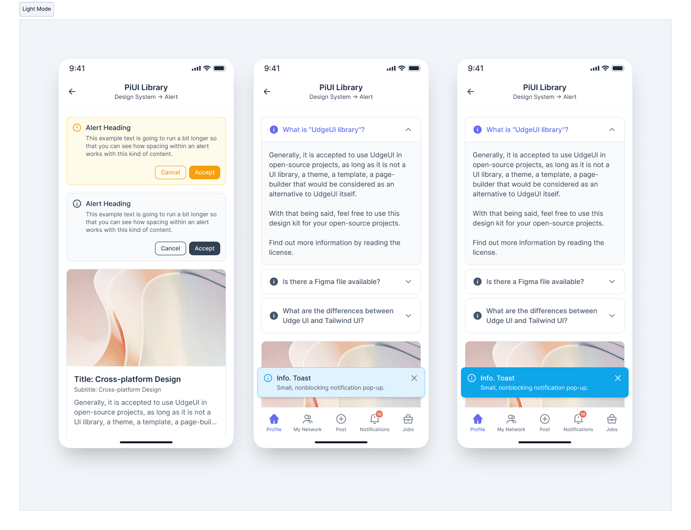
Why Alerts Were Built First 🚨
Alerts are deceptively complex. They communicate urgency, intent, and next steps—often in emotionally charged moments. Starting with alerts allowed us to define early standards around:
- Semantic color usage
- Typography hierarchy
- Action placement and priority
- Visual weight and tone
If an alert is unclear, the system has already failed.
Designing this component early ensures future components follow the same clarity and restraint.
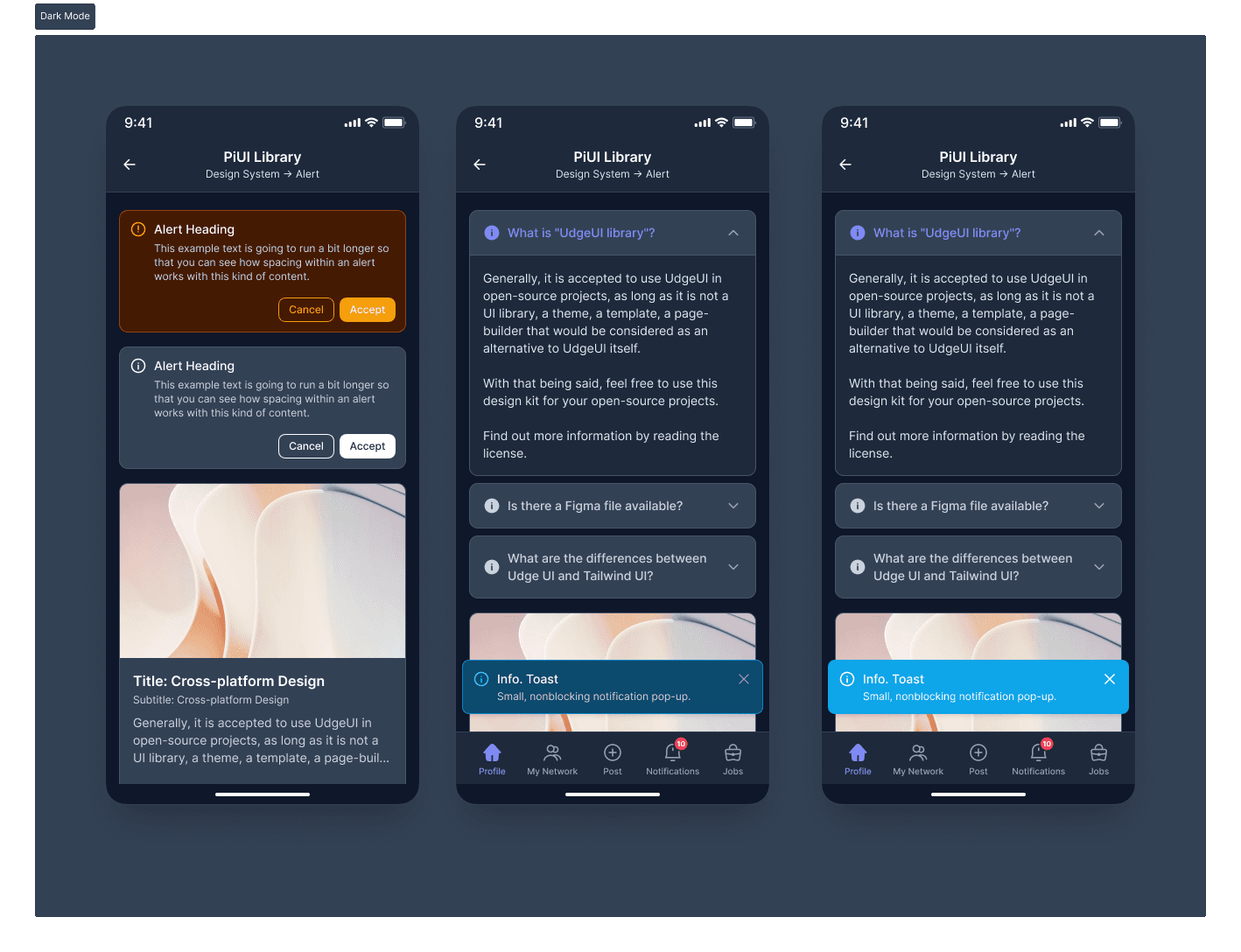
Light and Dark Mode as Equals 🌗
PiUI treats light and dark modes as first-class citizens. Dark mode is not layered on later—it is designed in parallel.
| Area | Light Mode | Dark Mode |
|---|---|---|
| Contrast | Soft, readable contrast | Balanced, non-harsh contrast |
| Backgrounds | Neutral, low noise | Reduced glare, low eye strain |
| Semantics | Color-driven meaning | Same meaning, adjusted tone |
| Structure | Identical | Identical |
The structure never changes—only the visual interpretation. This ensures consistency across themes without rethinking component logic.
Semantic Variants 🎯 Over Decorative Colors
Each Alert variant exists to communicate meaning, not aesthetics. Supported variants include: Information, Success, Warning, and Error. Colors are used to reinforce intent, not to decorate the interface. Even error states are designed to feel calm and readable rather than alarming. This helps users understand:
- What kind of message this is
- Whether action is required
- How urgent it feels
Master Components as a Non-Negotiable 🧩
Every PiUI component is created as a master component from the beginning. This decision shapes how the system scales.
| Benefit | Impact |
|---|---|
| Centralized updates | Fix once, reflect everywhere |
| Variant control | Clean management of states |
| Developer handoff | Clear mapping to code |
| Long-term scalability | Fewer broken instances |
This keeps PiUI cohesive as complexity increases.
Designed in Context, Not Isolation 📱
Components are validated inside real screens—not just component galleries. Testing alerts within realistic mobile layouts helps answer questions early:
- Does the alert overpower content?
- Is it readable at a glance?
- Are actions clear and reachable?
Design systems fail when components only work in isolation. PiUI is intentionally grounded in real UI usage.
♿ Accessibility as a Baseline
Accessibility is treated as a default requirement, not a later enhancement. From the first Alert component, PiUI considers:
- Color contrast
- Text readability
- Clear action affordances
This reduces future rework and ensures inclusivity from the start.
Accessibility is not a feature. It’s a responsibility.
How PiUI Will Evolve 🌱
With identity and one core component in place, PiUI now has a reference point. Future components will follow the same principles rather than reinventing patterns. Upcoming focus areas include:
- Design tokens (spacing, color, typography)
- Buttons and form primitives
- Navigation foundations
- Documentation and usage guidelines
Each addition strengthens the system instead of expanding it randomly. PiUI is not being built as a “component dump.” It’s a system that explains why decisions exist, not just what to use.
❇️ Starting a design system is less about speed and more about intent. Finalizing the PiUI logo and shipping the first Alert component — with full light and dark mode support and master components—sets a disciplined foundation. PiUI is early, but it is deliberate. And that deliberateness will matter more with every component that follows.